In this article, we will explore the fundamental fields of the Form Builder and their respective functions.
Questions answered in this article:
What are the different types of Basic Fields?
How can I set multiple answers for a specific question?
What is the use of a "Placeholder" when using a basic field?
Related articles:
What are Basic Fields?
Basic Fields refer to the elements or components used in a form to collect specific types of information from users. They are designed to capture data such as text, numbers, dates, selections, checkboxes, and more. Form fields enable users to input and submit information to fulfill a particular purpose, such as submitting an application, providing feedback, or completing a registration process.
Common examples of form fields include textboxes, dropdown menus, radio buttons, checkboxes, date pickers, and file upload buttons. Each form field has its own purpose and allows users to enter or select the relevant data required by the form.
Form fields play a vital role in gathering accurate and structured information, improving user interaction, and enabling effective data collection and processing.
Types of Basic Fields:
Textbox - An input box where users can enter and edit text-based information. It is typically a rectangular area on the form where users can type or paste text.
Form Editor View:

In Preview Mode:

Properties:
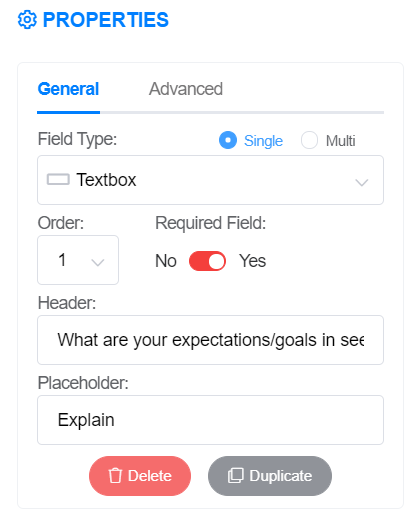
Field Type | Textbox |
Single/Multi(Line) | Single - The user can only enter a single line of response.
Multi - The user can enter more than a single line of response. |
Order | Order sequence of this field with other fields |
Required Field | When this field is set to 'Yes', it is mandatory for the user to enter a value in the textbox. Leaving the textbox null or blank will prevent the user from saving the form or proceeding to the next step. |
Header | A caption or text that provides guidance on what the user should enter or input into the textbox. |
Placeholder | A placeholder acts as a helpful and descriptive text, visible within an empty textbox, serving users with an illustrative example or suggestion of the expected input. Functioning as a temporary guide or prompt, it effectively indicates the specific type of information or format required for the textbox. |
Multiple Choice - This refers to a type of question or field that provides a set of predefined answer options, and the user is required to select one or more of those options as their response. It is a common method used in forms to gather structured and specific feedback or information from users.
Form Editor View:

Preview Mode:

Properties:
Field Type | Multiple Choice |
Single/Multi | Single - The user can only choose one option from the given list.
Multi - The user can choose more than one option from the given list. |
Order | Order sequence of this field with other fields |
Required Field | When this field is set to 'Yes', it becomes necessary for the user to provide a value in the Multiple Choice field. Leaving the multiple choice field null or blank will prevent the user from saving the form or proceeding to the next step. |
Title/Description | A caption or text that helps users understand the question or topic the multiple choice field is addressing. |
Placeholder | A descriptive text that appears to provide users with an example or suggestion of the expected response. |
Content | Set if the answer choices would be manually added, or from a DB (database).
 |
Add Option(s) | The "Add Option" button enables users to include additional answer choices when setting up a multiple-choice question. |

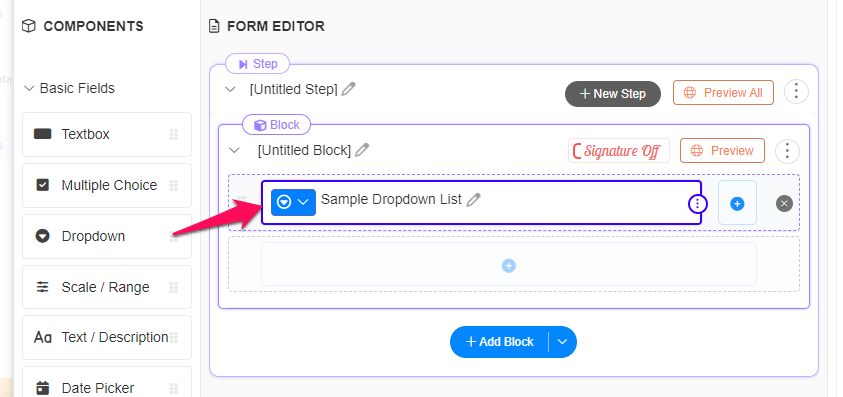
Dropdown - A dropdown list, also referred to as a dropdown menu or select box, presents users with a range of options from which they can choose from.
Form Editor View:
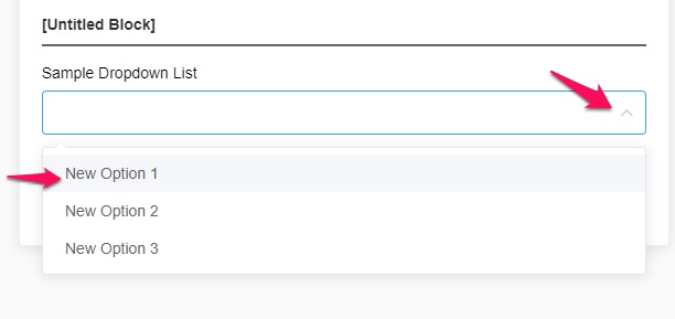
Preview Mode:
Properties:
Field Type | Dropdown |
Single/Multi | Single - The user can only choose one option from the given list.
Multi - The user can choose more than one option from the given list. |
Order | Order sequence of this sequence from other fields. |
Required Field | When this field is set to 'Yes', it is mandatory for the user to provide a value in the dropdown list. Leaving the dropdown null or blank will prevent the user from saving the form or progressing to the next step. |
Title/Description | A caption or text that helps users understand the question or topic the dropdown field is addressing. |
Placeholder | A descriptive text that appears to provide users with an example or suggestion of the expected response. |
Content | Set if the answer choices would be manually added, or from a DB (database).
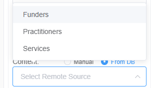 |
Add Option(s) | The "Add Option" button enables users to include additional answer choices when setting up a dropdown list. |

Scale Range - a type of input field that allows users to provide a value within a predefined range. It typically represents a continuum or scale with minimum and maximum values. Users can select or input a value that falls within the specified range, providing a measurement or rating based on the scale.
Form Editor View:

Preview Mode:

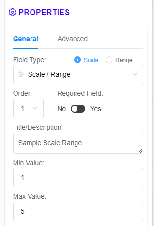
Properties:
Field Type | Scale Range |
Scale/Range | Scale - The user can only choose 1 value within the given scale.
Range - The user can choose the starting/minimum and ending/maximum values covered within a scale. |
Order | Order sequence of this field with other fields |
Required Field | When this field is set to 'Yes', it is mandatory for the user to enter a value in the Scale Range. Leaving the Scale Range null or blank will prevent the user from saving the form or proceeding to the next step. |
Min Value | Minimum Value within the scale. |
Max Value | Maximum Value within the scale. |
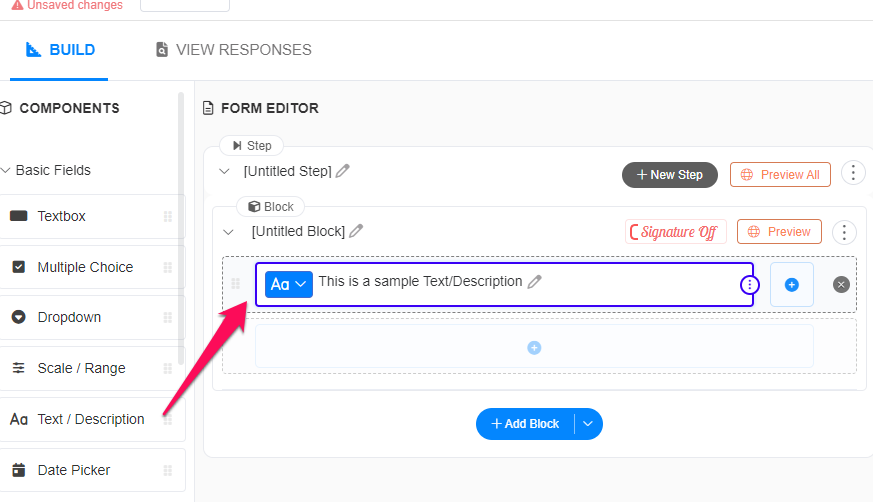
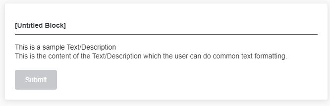
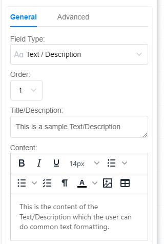
Text/Description - a display area that presents text or descriptions to users without allowing them to modify the content. It is designed for read-only purposes, providing information or instructions that users can view but not edit.
Form Editor View:
Preview Mode:
Properties:
Field Type | Text/Description |
Order | Order sequence of this field with other fields |
Title/Description | A caption or text that provides guidance to the user on what the Text/Description is about. |
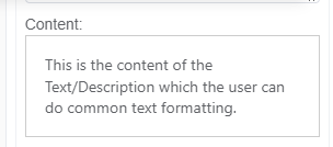
Content | The following is the detailed or extended content of the Text/Description, allowing the user to apply common text formatting.
 |
Date Picker - a visual representation of a calendar, typically with navigation buttons to move between months or years. Users can click on a specific date to select it as their desired date.
Form Editor View:

Preview Mode:
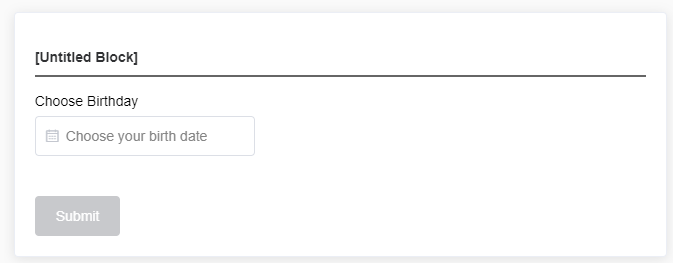
Properties:
Field Type | Date Picker |
Single/Range | Single - The user can only choose a single date.
Range- The user can choose a range of days. |
Order | Order sequence of this field with other fields |
Required Field | When this field is set to 'Yes', it is mandatory for the user to enter a value in the date picker. Leaving the date picker null or blank will prevent the user from saving the form or proceeding to the next step. |
Header | A caption or text that provides guidance on what the user should enter or input into the date picker. |
Placeholder | A descriptive text that appears within an empty date picker field to provide users with an example or suggestion of the expected input. The placeholder text disappears once the user chooses a date. |
